 |
| Rio Ruiz needs to change his name to "Rio Bandita." Amiright? |
 2) There are many teams represented, and not just at the same level. Granted, the set is supposed to highlight the 225 best players (or most hyped) minor leaguers in the system, but it's still fresh to open a pack and get a handful of players from different levels. Also, some of the team names are just ridiculous. Drive? Power? Storm? C'mon. At least at seems some thought went into "Lug Nuts" and "Blue Rocks," although both are smirk-ready for a bus full of 19-year-old jocks.
3) Each player smacks of potential, upside, whatever you want to call it. Not every one of these guys will star at the Major-League level. Heck, most of these probably won't even get to the Major Leagues. But that's what makes a set like this great: You can smell the optimism when you open the pack.

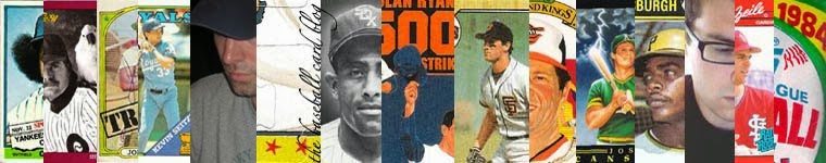
4) The traditional Topps "magazine-cover" design of the 1964 base set really works for some of these cards. They look like how a classic baseball card should look. You know what I mean? This card of Michael Choice is what I'm talking about. Actually, many of the cards achieve this effect, but those with bats leaving the frame work the best.
5) I counted four sons of ex-Major Leaguers on the base set checklist who shared their dads' famous names. And then there's Mike Piazza. Born in 1986, he's too old to be the son of Mike Piazza, right? This is some "Baseball's Two Hal Smiths" territory here, folks.
 6) If I have a son, I will definitely give him a weird name. Because if today's crop of 20-year-olds is any indication, an off-the-wall name will give him better than a fifty-fifty chance of achieving professional sports stardom—or at least a shot at making the cast of a reboot of American Gladiators.
 Finally, best card of the set: Joe Panik, Flying Squirrels. Let's be honest: If a flying squirrel was coming at you, I'd bet the first thing you'd think of is "panic."
3 comments:
I'm with you. Lots of great points. If nothing else I love all the minor league logos.
Very cool. How close to the set did you get? If it is really close I might pick up a box.
Adam: I got really close to completing the base set (cards #1-200). I think I was missing 8 cards. Plus the box yielded 4 short prints from cards #201-225. Yeah, it was a good deal, though you could probably pick up the base set for $20 or so, I'd imagine.
Post a Comment